BIENES
Insurance Brand Identity
Project Concept Label
Logo Design, Brand Identity
Project Type
INTRODUCTION
Bienes Insurance Agency approached Blendin Creative with the goal of building a strong, professional brand identity that reflected trust, stability, and credibility. While their services were reliable and client-focused, their visual identity did not fully communicate their expertise or stand out in a competitive insurance market. Their branding lacked consistency, clarity, and a memorable presence. They needed a logo that would instantly inspire confidence and position them as a modern, dependable insurance provider.
DESIGNING METHOD
Our logo design process focused on clarity, symbolism, and long-term usability. We began by understanding Bienes’ values, target audience, and service offerings. From there, we explored concepts centered around protection, reliability, and growth — key pillars of the insurance industry.
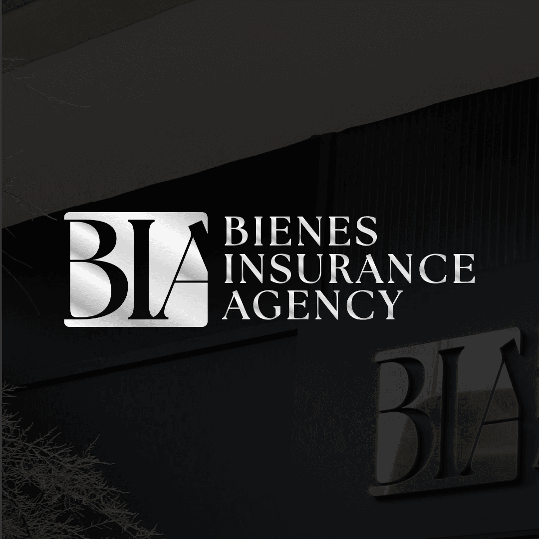
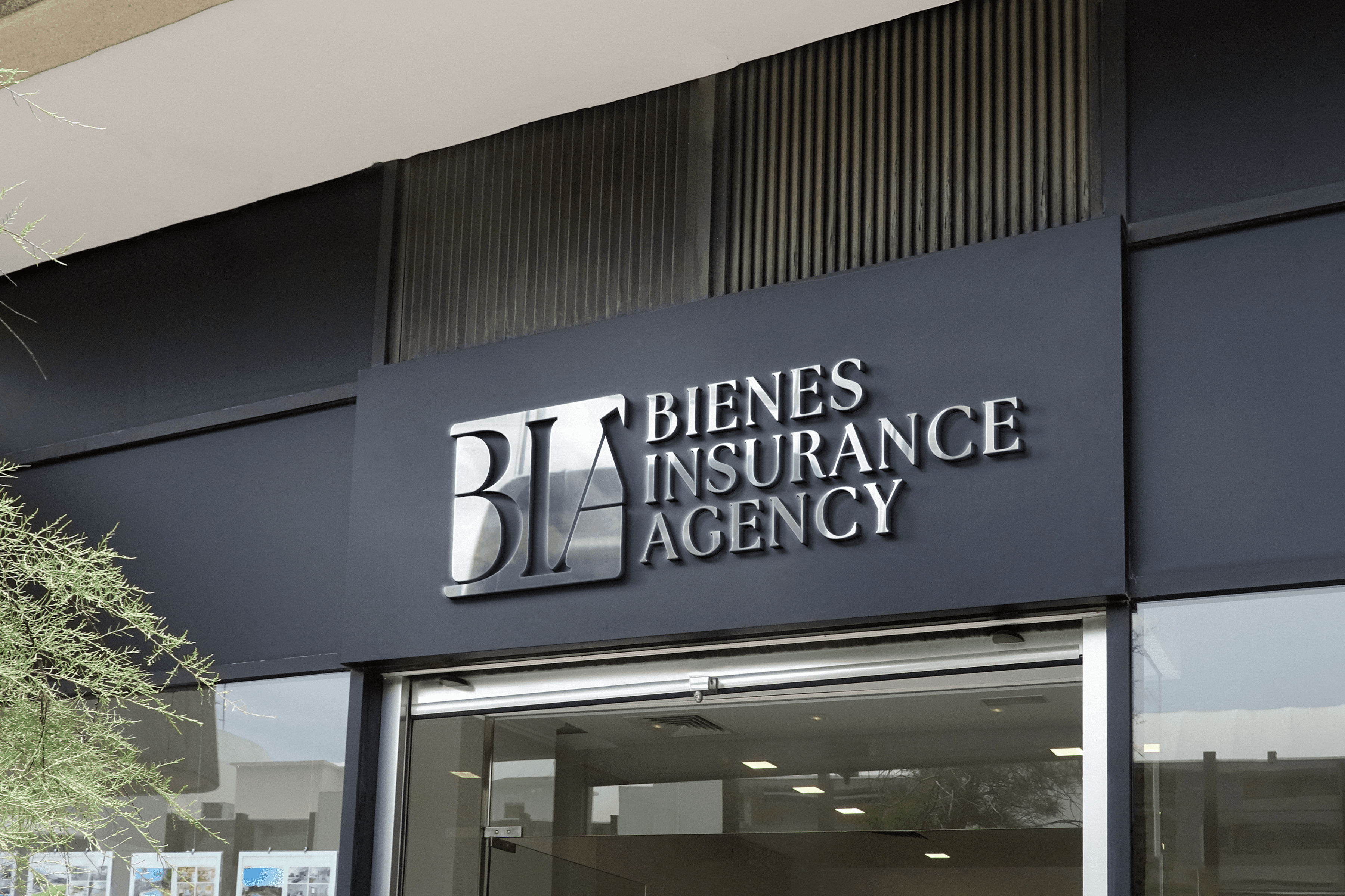
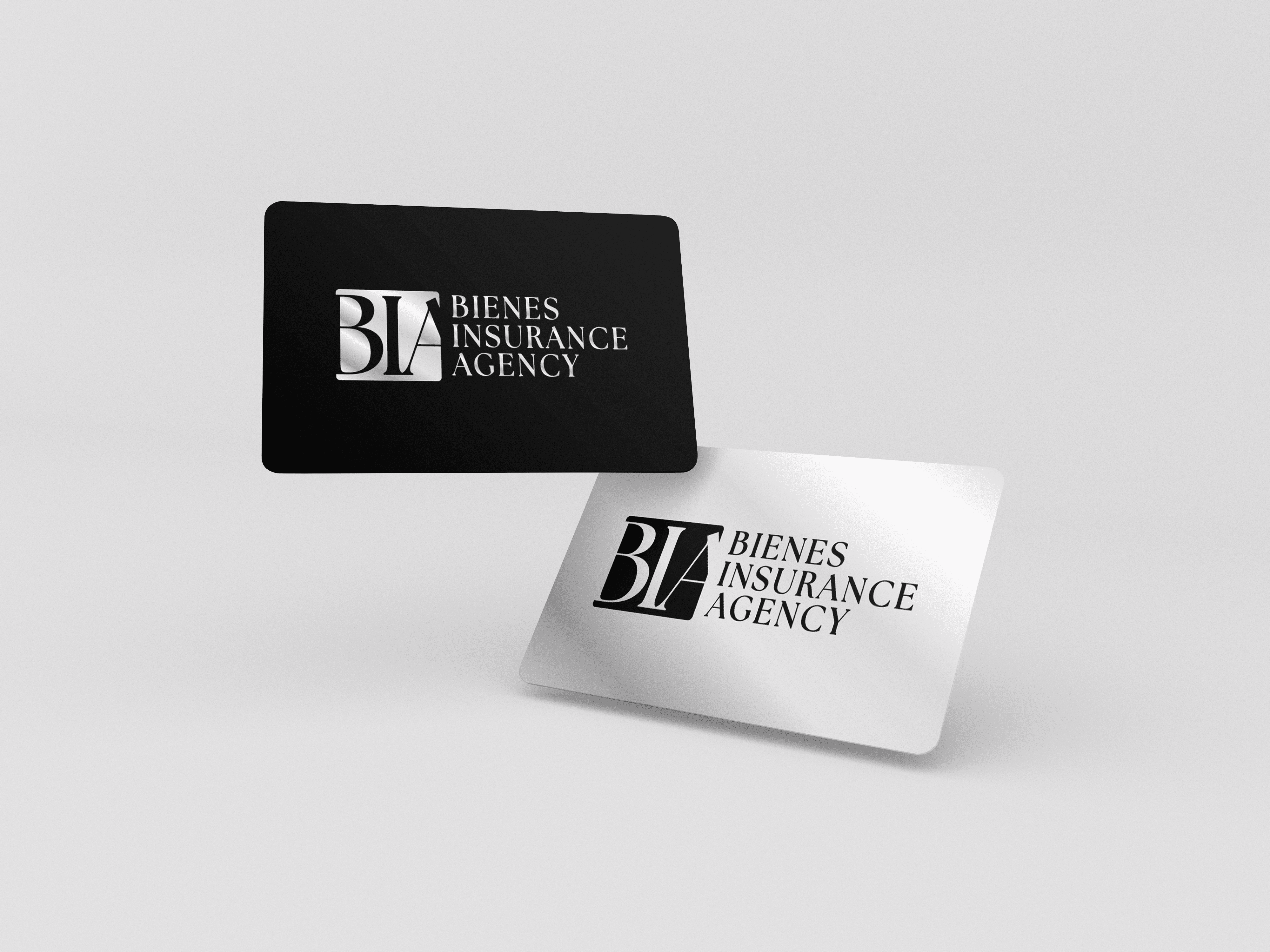
The design approach included: • Clean, professional typography • Balanced proportions for versatility • Strong iconography for recognition • A refined color system that conveys trust • Scalable formats for digital and print use Each concept was refined through multiple iterations to ensure the final mark remained timeless, adaptable, and easy to recognize across platforms. The final logo works seamlessly on websites, business cards, signage, social media, and marketing materials.
FINAL PERFORMANCE
The new logo immediately strengthened Bienes Insurance Agency’s brand presence. With a clear and consistent visual identity, the agency now presents itself with confidence and professionalism. The updated branding improved recognition and helped establish trust with both new and existing clients. Following the rebrand, Bienes experienced: • Stronger brand consistency • Improved visual credibility • Increased confidence in marketing efforts • A more recognizable public image The logo now serves as the foundation for their entire visual system and supports future brand growth.