
Featured workBrand identity
Explore the identity Illustrative brand mockupThe starting point.
Jolt Financial needed a clearer, more recognizable identity that could express stability and modern financial expertise without disappearing into the category.
- Client
- Jolt Financial
- Scope
- Logo design / Visual identity
- Studio
- Blendin Creative


The design direction.
The direction combined a compact geometric mark with confident typography and an architectural image language designed to work across web, print, presentations, and signage.
- Compact geometric J symbol
- Professional high-contrast typography
- Architecture-led visual language
- Consistent presentation and marketing applications
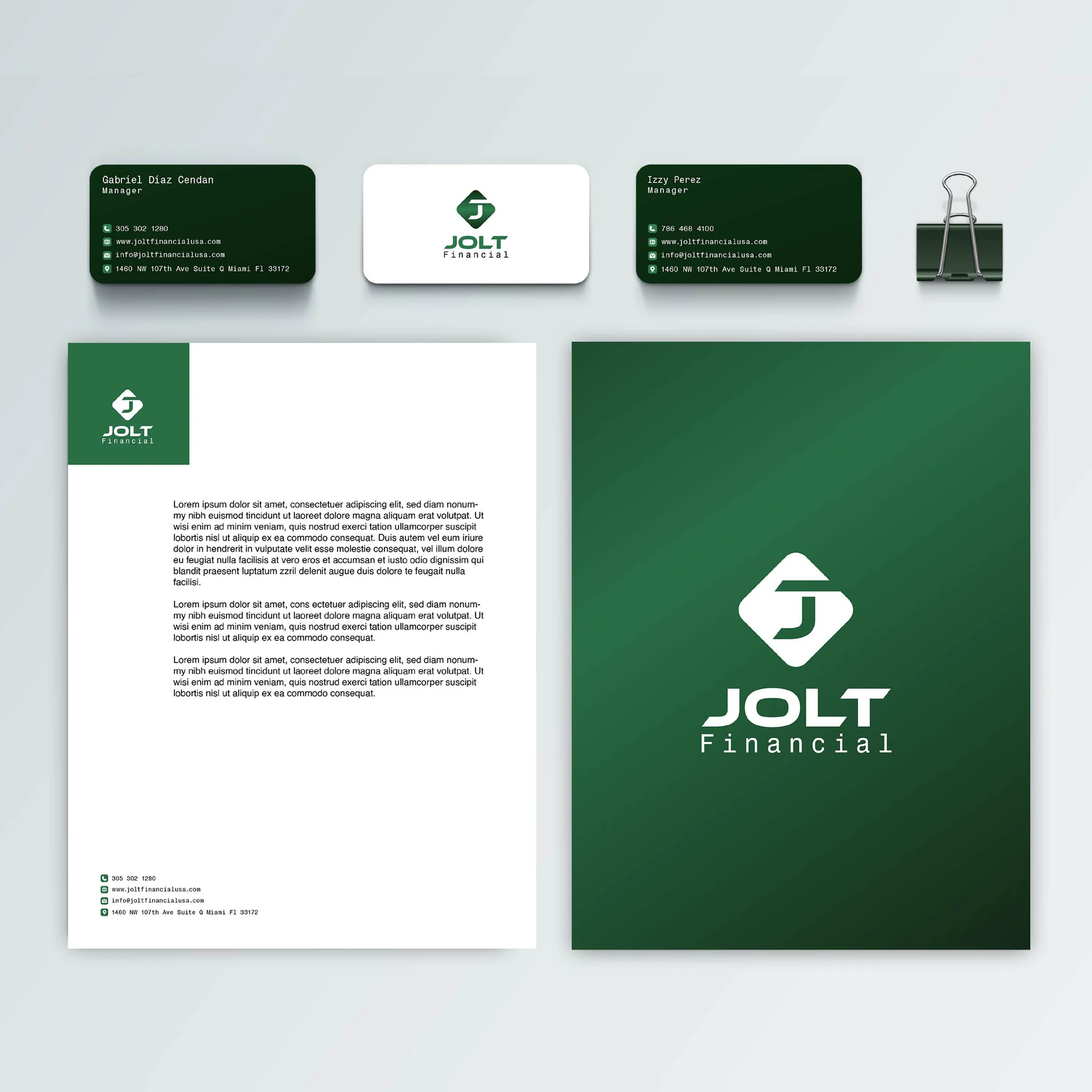
The identity in use.
Jolt Financial identity applied across professional materials
The resulting identity
The cohesive system gives Jolt a stronger professional presence and a reusable identity for long-term communication across client and marketing touchpoints.
Explore the complete identity presentation

Your brand has
a story, too.
Let’s give it a clear, recognizable identity.
