Bienes Insurance Agency
Insurance brand identity
Identity turns the strategy behind a business into a visual language people can recognize and remember.
Selected projects
See how a visual idea becomes a recognizable brand in the real world.
Insurance brand identity
Immigration logo reimagined

Financial brand identity
Modern café branding
A strong identity turns strategy into a recognizable system, so the website, social content, presentations, signage, packaging, and everyday communication all feel like the same business.
These capabilities are shaped into one project scope around the business, the launch, and the touchpoints that matter first.

We clarify the audience, category, personality, and business ambition before deciding what the brand should look and feel like.

We create a distinctive signature and the configurations it needs to stay recognizable across real formats and scales.

We build the supporting visual rules that make the identity feel connected even when the logo is not the loudest element.

We apply the system where the business needs it first, then organize the rules and files so the identity can keep working after launch.
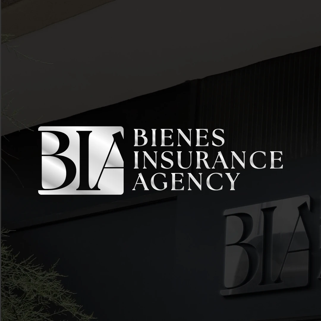
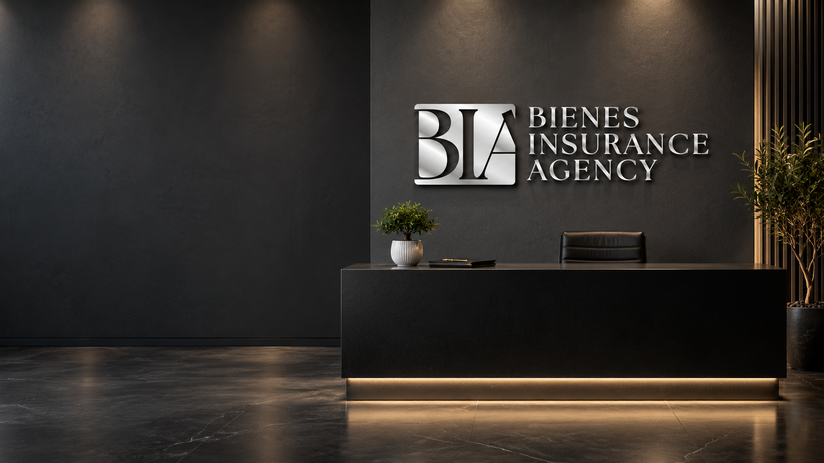
A recognizable brand comes from repeating the right details. Here’s how the Bienes monogram, typography, and restrained palette carry from the signature into everyday materials and a physical space.
The BIA monogram and serif wordmark create a clear visual signature. Their proportions and contrast give every application the same point of reference.
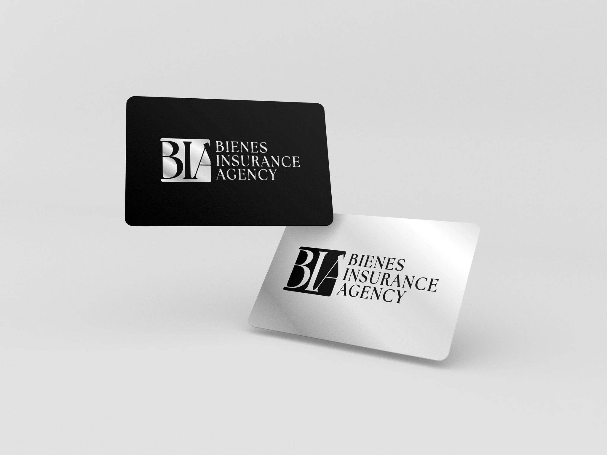
Consistent typography, spacing, and a restrained palette connect the printed materials. Different formats still feel like one business.
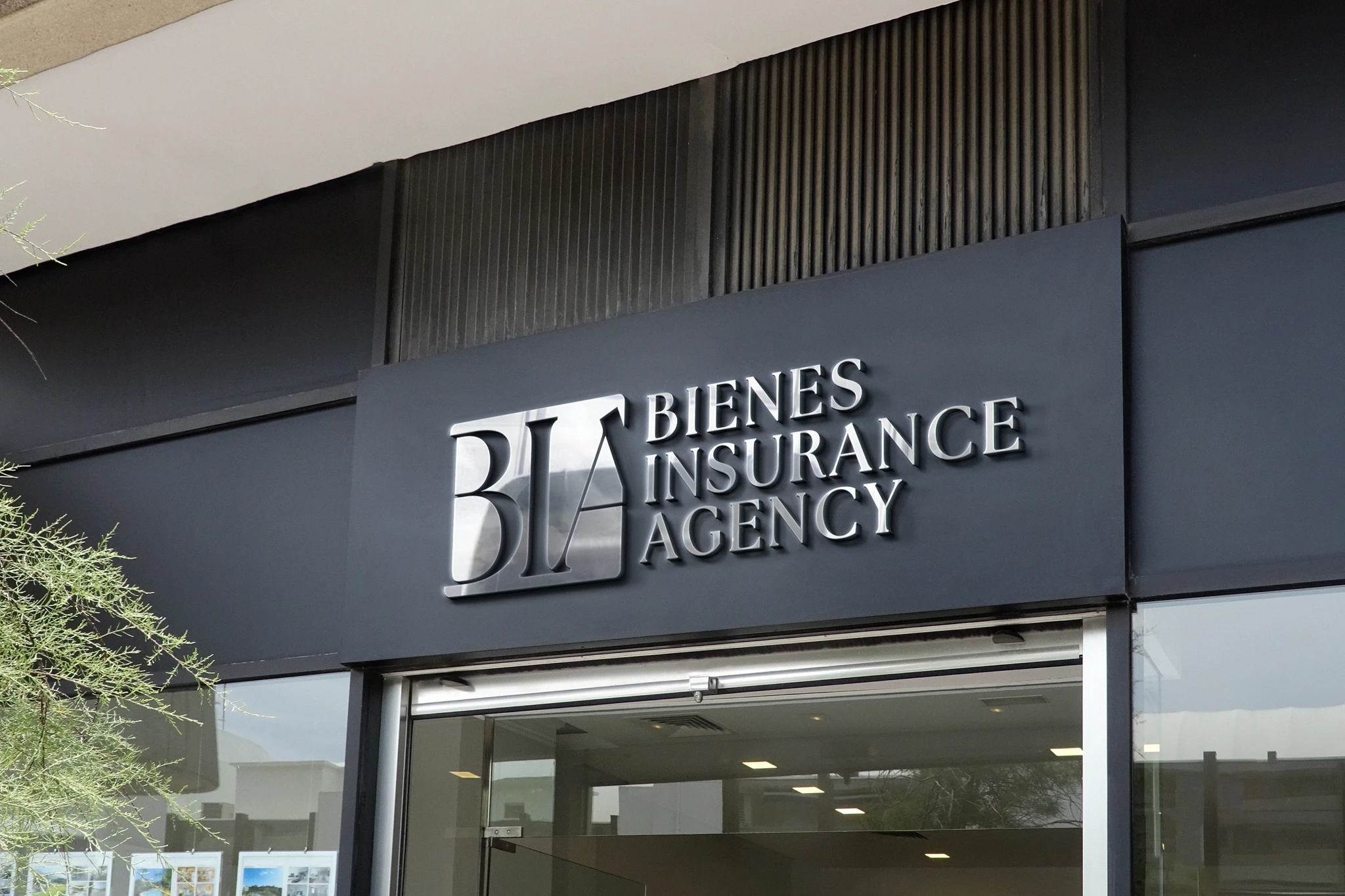
The same signature becomes dimensional signage. The materials change, while the recognizable forms and hierarchy stay consistent.
Common projects include new identities, thoughtful rebrands, identity expansions, brand consolidation, and launch systems for growing service and product businesses.
The depth changes with the project, but every engagement moves from context and direction into a system that can perform in the real world.

Align the audience, offer, category context, business ambition, practical needs, and decision makers.

Define the useful idea, personality, points of difference, and creative criteria the identity needs to express.

Build distinct visual territories so the team can evaluate the strategic idea before the full system is developed.

Refine the selected direction into a connected logo, color, type, image, and composition system.

Test the identity across the priority touchpoints included in the project so it works beyond a presentation slide.

Prepare the approved files, usage guidance, and handoff around the people who will use the brand next.
Yes. The logo is the signature. A brand identity also connects color, typography, imagery, composition, applications, and practical rules so the business can look recognizable across different touchpoints.
Yes. We can assess whether the existing mark can anchor a stronger identity system, needs a careful refinement, or is limiting the business enough to justify a redesign. That recommendation comes before the visual scope is finalized.
Naming, verbal identity, taglines, and message development can be scoped when needed. They are not automatically included in every visual identity project, and legal availability or trademark clearance requires qualified legal review.
The number of directions, review rounds, and decision points is defined in the approved project scope. We use a staged process so feedback is focused on the right decision at the right time.
Delivery is planned around the approved applications and the people using them. It can include common logo formats, color and typography specifications, lockup guidance, application examples, and a practical brand guide.
Yes. Priority launch materials, website design, social content, campaign assets, templates, signage, packaging, and ongoing support can be included or planned as a connected next phase.
Tell us what the business is becoming, where the current identity falls short, and which touchpoints need to feel connected first.

BLENDIN CREATIVE